San Francisco is a place I’ve been to many times, but never thought in-depth about the environment and ecosystem there. When I saw the dataset about fish in the estuary, I chose it simply because the data seemed clean and easy to wrangle. It wasn’t until I began designing the infographic that I became very intrigued by the information I could display. I learned about the intentionality of the sample sites, and the meaning behind the abiotic features and fish species caught at each location.
My data comes from “Interagency Ecological Program: Over four decades of juvenile fish monitoring data from the San Francisco Estuary, collected by the Delta Juvenile Fish Monitoring Program, 1976-2024”, which is the result of a program from the United States Fish and Wildlife Service. The data, as well as the metadata, can be found at this link https://portal.edirepository.org/nis/mapbrowse?scope=edi&identifier=244
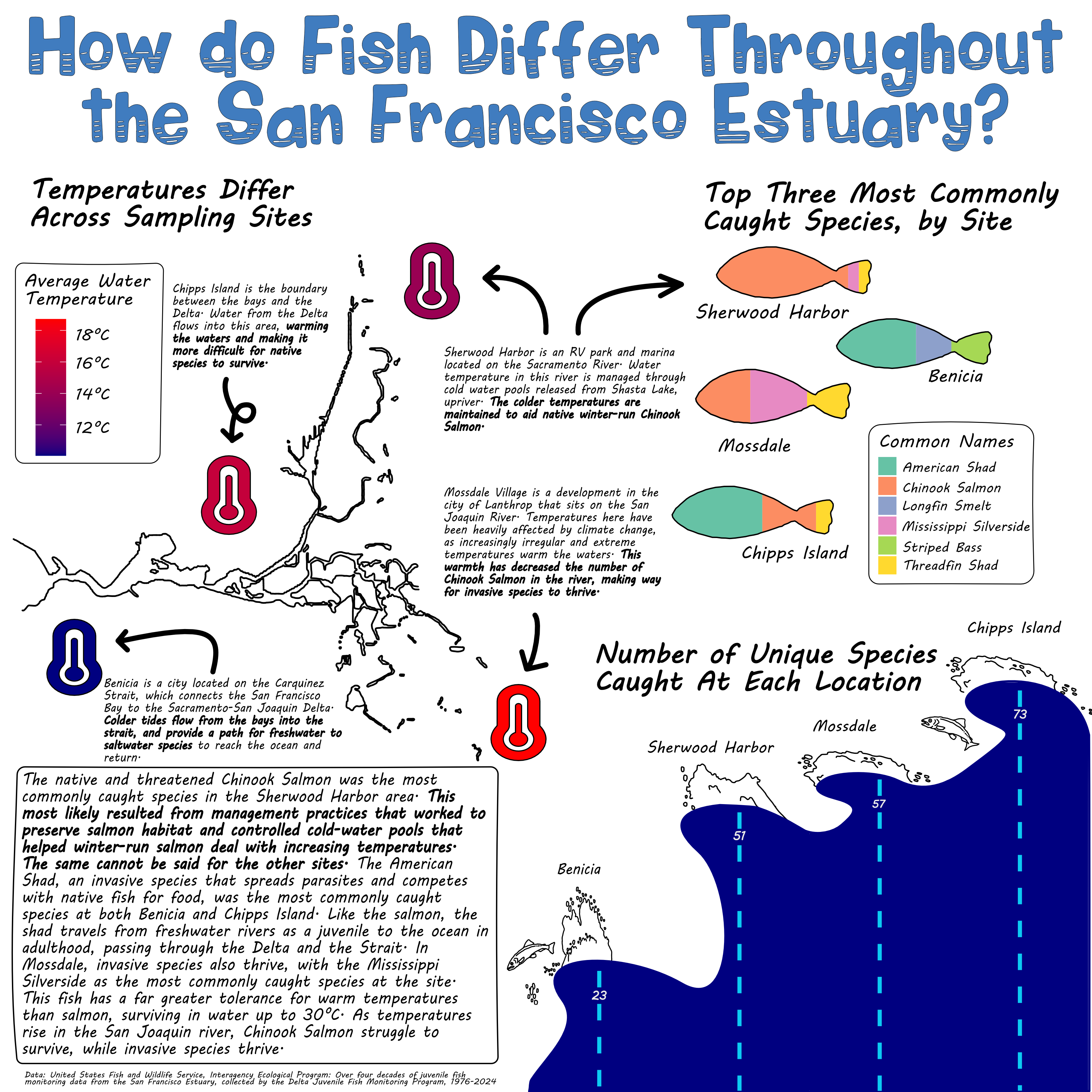
The question that my infographic is answering is How do fish and other marine species catches differ between sites in the San Francisco Estuary? I created three sub-questions, one for each plot. The first question is What are the top three most caught marine organisms at each site?, and I answered this question with a bar chart which I made look like fish. The second question is How many unique marine organisms were sampled at each site?, which I answered with a bar chart that I made into the shape of waves. The third question is What is the average water temperature differences between each site?, which I answered with a scatter plot with the color of the points representing the average temperature.
Here is how my infographic turned out!
I always love making data visualizations as fun as possible. Data can often feel very serious and dry, and I like to challenge myself to change that narrative, hence my colorful and playful themes I went with in this graphic. Here are some elements that I thought about in my infographic:
Graphic Form
I chose some very basic types of plots for my infographic. I only used a scatter plot and bar charts. I liked that these are extremely easy to read and interpret, but also have a lot of potential for customization.
Text
I chose to remove the axis labels from my plots, because I felt that the simplicity of the plots made them legible even without axis labels. I did add titles to every plot, but the most text this infographic has are annotations. I felt like the annotations was the most important part of the infographic, because it supplied some much needed context to the plots. Without them, the infographic does not tell such a detailed story of the importance of the San Francisco Estuary.
Themes
In ggplot, I modified the themes of all of the plots. I changed the width of my bar charts, the colors, the sizes of my points, and the shape of my points. I then transferred all of my work to affinity, where I added some major design elements like making one chart into the shape of waves and another into the shape of fish.
Colors
I wanted my infographic to have playful and fun vibes, while still having colors that made sense. All of my palettes are colorblind friendly, and make sense for what they’re visualizing. The wave chart is blue, and the thermometers have a blue to red palette. I had more fun with the colors of the fish, making them colorful and fun.
Typography
I had so much fun with finding cool water and fish themed fonts online. I tested out a bunch of them, and decided that the font Wavepool and MV Boli matched my playful theme I was going for the most. I wanted it to look handwritten, while also staying very legible.
General Design
Because my plots were pretty minimal, I went a little crazier with the annotations. I used font thickness, size, color, and boxes around text to draw the eye to different elements. There is a lot of information, but I liked the vibe of that, and it was an intentional decision. Without the text that it has, the story of the infographic is very different and less meaningful.
Contextualizing My Data
In boxes in bigger font I gave an overview of the estuary as a whole, and then gave context about individual sites and pointed to their locations through smaller unframed annotations. By doing this, I fit in a lot of information about the estuary and still managed to keep it aesthetically pleasing.
Centering My Primary Message
The primary message was to think about the ecosystem and environment of the estuary. I wanted to show the problems in the estuary such as invasive species, and also the reliance that humans and animals have on the estuary. I put this information in boxes and annotations around the graphic.
Considering Accessibility (e.g. colorblind-friendly palettes / contrast, alt text)
I considered accessibility be making the palette colorblind friendly and adding alt text in the code to make it accesible to visually impaired users.
Applying a DEI lens to my design, as appropriate (e.g. considering the people / communities / places represented in your data, consider how you frame your questions / issue)
I thought about people that live and have lived in the area and how they are and were effected. This was something I made sure to mention, as even an infographic more about ecology, still affects people and communities.
If you’re interested in the code behind this infographic, take a look below
Code
# load librarieslibrary(tidyverse)library(here)library(janitor)library(ggtext)library(showtext)# add font awesome fontsfont_add('fa-reg', 'fonts/Font Awesome 6 Free-Regular-400.otf')font_add('fa-brands', 'fonts/Font Awesome 6 Brands-Regular-400.otf')font_add('fa-solid', 'fonts/Font Awesome 6 Free-Solid-900.otf')font_add_google(name ="Flavors", family ="flavors")font_add_google(name ="Outfit", family ="outfit")showtext_auto()# load datafish_02_24 <-read_csv(here("posts", "fish_infographic", "data", "2002-2024_DJFMP_trawl_fish_and_water_quality_data.csv"))locals <-read_csv(here("posts", "fish_infographic", "data", "DJFMP_Site_Locations.csv"))# clean datafish_clean <- fish_02_24 |>clean_names() |>select_if(~sum(is.na(.)) <750000)# find unique common names by locationfish_unique <- fish_clean |>select(location, common_name, sample_date) |>group_by(location) |>summarize(nunique =n_distinct(common_name)) # plot amount of unique species per locationunique_plot <-ggplot(data = fish_unique, aes(x = location, y = nunique)) +geom_col(color ="blue3", fill ="navy", width =1) +geom_text(aes(label = nunique, vjust =4), color ="white", size =5,family ="outfit") +theme_bw() +scale_x_discrete(expand =c(0, NA)) +scale_y_continuous(expand =c(0, NA), limits =c(0, 80)) +labs(title ="Number of Unique Species Caught at Each Location" ) +theme(axis.title.x =element_blank(),axis.title.y =element_blank(),# I anticipate changing the style of the title in affinity so I'll leave it for nowtitle =element_text(family ="outfit"),axis.text =element_text(family ="outfit",size =12),panel.grid.major =element_blank(),panel.grid.minor =element_blank(),panel.border =element_blank(),panel.background =element_blank(),axis.ticks =element_blank(),axis.text.y =element_blank())# filter for only the sites in the fish_clean dataset, and select only long and latlocals_sites <- locals |>filter(Location ==c("Chipps Island", "Benicia", "Mossdale", "Sherwood Harbor")) |>select(Location, Latitude, Longitude) |>clean_names()# select only needed columns for questionfish_abiotic <- fish_clean |>select(location, weather_code, water_temp) |>na.omit(water_temp, weather_code) # find average water temp by locationfish_water <- fish_abiotic |>group_by(location) |>summarize(avg_water_temp =mean(water_temp)) # find average (mode) weather by locationfish_weather <- fish_abiotic |>group_by(location) |>summarize(weather = DescTools::Mode(weather_code))# join all datasets togetherfish_join <- fish_weather |>full_join(fish_water, join_by(location)) local_join <- fish_join |>full_join(locals_sites, join_by(location)) # plot scatter plot with color as water temperaturetemp_plot <-ggplot(data = local_join, aes(y = latitude, x = longitude, color = avg_water_temp, label ="<span style='font-family:fa-solid;'></span>")) +# geom_point(size = 10) +geom_richtext(size =60, label.colour =NA, fill =NA) +scale_color_gradient(low ="navy",high ="red") +labs(title ="Temperatures Differ Across Sampling Sites",subtitle ="Average temperature changes up to ten degress between sites",color ="Avg. Water Temp (°C)") +theme_bw() +theme(axis.title =element_blank(),axis.text =element_blank(),axis.ticks =element_blank(),panel.grid.minor =element_blank(),panel.border =element_blank(),panel.background =element_blank(),title =element_text(family ="outfit",size =15),legend.text =element_text(family ="outfit"),legend.position ="left" ) # Calculate the catch count for each common_namefish_max <- fish_clean |>group_by(location, common_name) |>summarize(max_catch =n(), .groups ="drop") # Find the top three highest catches for each locationfish_top <- fish_max |>filter(common_name !="No catch") |>arrange(desc(max_catch)) |>group_by(location) |>slice(1:3) # plot top three catch types by sitefish_top_three <-ggplot(data = fish_top, aes(fill = common_name, x = location, y = max_catch)) +geom_bar(position ="fill", stat ="identity", width = .7) +scale_fill_brewer(palette ="Set2") +labs(fill ="Common Names") +# this isn't working with a filled bar chart, I'll just add labels in affinity# geom_text(aes(label = max_catch)) +theme(axis.title =element_blank(),axis.text.x =element_blank(),axis.ticks =element_blank(),panel.grid.major =element_blank(),panel.grid.minor =element_blank(),panel.border =element_blank(),panel.background =element_blank(),legend.text =element_text(family ="outfit"),axis.text =element_text(family ="outfit") ) +coord_flip()showtext_auto(FALSE)